Five tracks. Each one taught by someone who still does the work for a living. Cohorts are small — 8 people max — so you'll get actual feedback, not a thumbs-up emoji in a chat window.
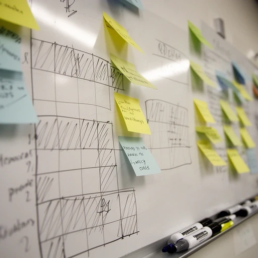
You'll learn to think in grids before you touch a single line of code. We start with spacing scales and proportional systems, move into multi-column layouts, and finish with three full page rebuilds from real client briefs. No Bootstrap, no Tailwind — just raw CSS Grid and Flexbox until you understand what those frameworks are hiding from you.
Build a magazine-style article layout. Reconstruct a SaaS pricing page from a Figma mockup. Design and code a responsive portfolio grid that doesn't collapse into a mess at 768px. Each project gets a live crit session with the group.
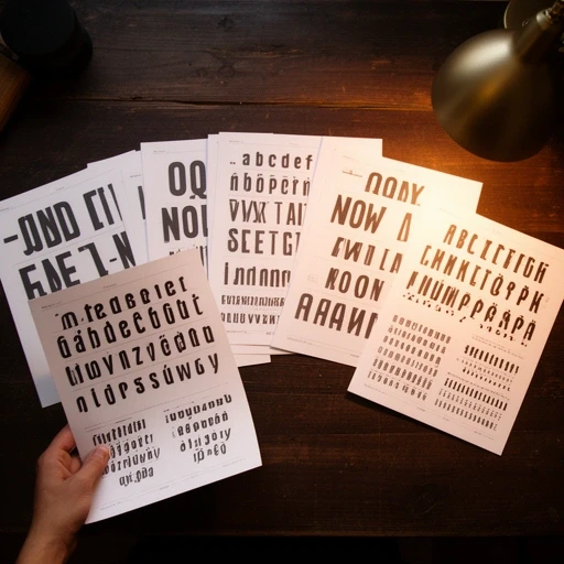
Choosing a font takes five minutes. Making it work across headings, body, captions, buttons, and mobile — that takes four weeks. We'll cover optical sizing, scale ratios, vertical rhythm, and why most Google Fonts combos look the same. You'll learn to pair typefaces by contrast rather than vibe.
Redesign the typography of an existing live website (we provide the brief). Create a type specimen page. Build a responsive type scale using clamp() that works from 320px to 1920px without a single breakpoint. Present your rationale to the group.

The gap between design and code is smaller than people make it sound. But it's full of weird little problems: auto-layout doesn't map 1:1 to CSS, spacing tokens get lost in translation, and exported SVGs are a mess half the time. This course is about bridging that gap without losing your mind or your designer's trust.
Receive a polished Figma file every Monday. Ship a pixel-accurate HTML/CSS page by Friday. Get it reviewed by a tutor who's done this exact job for ten years at agencies. Repeat five times, each brief harder than the last.
Everyone knows media queries. Fewer people know when not to use them. We'll go through container queries, fluid type with clamp(), intrinsic layouts with min(), and the patterns that actual production sites use when they've got 50,000 daily visitors and can't afford a layout jump at 1024px.
Audit a live site for responsive issues using real devices (we ship you a testing kit if you're remote). Rebuild its most broken page. Document your fixes as a case study. Test on at least four screen sizes including one you've never heard of.
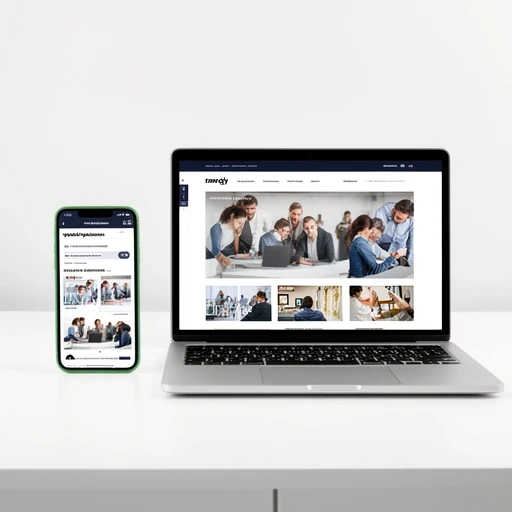

Your portfolio isn't a gallery. It's a sales document. Most junior designers treat it like a Dribbble feed — pretty screenshots with no context. We'll teach you to write case studies that answer the question hiring managers actually care about: "Can this person think through a problem?"
Write and design two complete case studies with problem/process/outcome structure. Get two rounds of 1-on-1 feedback from Marcus (he's reviewed 200+ junior portfolios). Build or rebuild your portfolio site. Ship it live before the course ends.
| course | duration | sessions | price |
|---|---|---|---|
| layout fundamentals | 6 weeks | 12 live | £380 |
| typography & type pairing | 4 weeks | 8 live | £290 |
| figma to production code | 5 weeks | 10 live | £340 |
| responsive design patterns | 4 weeks | 8 live | £310 |
| portfolio that gets replies | 3 weeks | 6 live + 2 one-on-one | £220 |
All prices include VAT. Instalment plans available on courses 3+ weeks — just email us to arrange it.
Pick a course, pick a cohort. Or if you're not sure which one fits, drop us a message and we'll talk it through. No sales pitch — we'd rather you pick the right course than the expensive one.
get in touch